Brand & social
Branding as a working system.
The V monogram, six Instagram stories, four YouTube thumbnails, two long-form infographics, and an interactive brand toolkit you can play with — palette swatches with copyable hex codes, live typography specimens, the voice rules every page on this site follows.
Chapter 01
The mark. A two-tone metallic V.
Sculpted black + brushed gold. Photographed in studio across three surfaces — light, dark, and tight crop. Used as the corner plate on every social card and the mast of every internal communication.

Primary · light surface
The hero shot.
v-hero.jpg · 2048 px

Inverse · dark surface
The void variant.
v-dark.jpg · 1024 px

Tight crop · light
Corner badge.
v-mark-light.jpg · 600 px
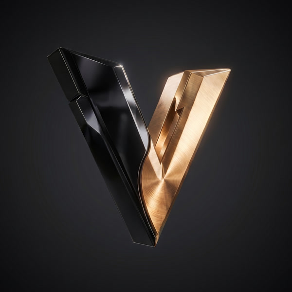
Tight crop · dark
Corner badge, inverted.
v-mark-dark.jpg · 600 px
Chapter 02 · 9:16 · 1080 × 1920
Instagram stories. six brand cards.
The brand applied as Instagram-story-sized graphics. The first card is the Vibe Coding manifesto; the next five frame the AI tools the studio ships on. Each card features the real V monogram plated top-left and a single italic-gold accent word in the headline.
Chapter 03 · 16:9 · 1920 × 1080
YouTube thumbnails. four thumbnails.
Wide editorial thumbnails for long-form video. The hero is the Vibe Coding manifesto; alongside it sit the 2026 AI Stack, the Anatomy of a Build Day, and the Brand of One essay. Same V mark, same italic accent, retuned for the 16:9 frame.
Chapter 04
Infographics. Two long-form pieces.
Design as a way of explaining. The first is the brand on a single sheet — palette, typography, mark. The second decomposes a real prompt into its five working phrases — format, subject, setting, lighting, reference.

BRAND SHEET · VOL.01
The Brand at a Glance
A one-page brand summary: the six palette swatches with hex codes, the three typefaces in specimen form (Inter Tight bold sans, Instrument Serif italic gold, JetBrains Mono uppercase), the V mark, the rules between them. Editorial.
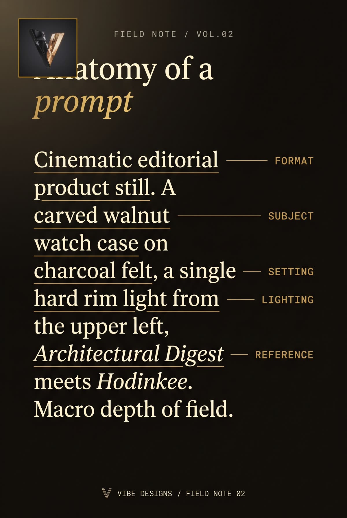
FIELD NOTE · VOL.02
Anatomy of a prompt
The exact prompt for a watch product still, broken into five labeled phrases — FORMAT, SUBJECT, SETTING, LIGHTING, REFERENCE — each connected by a gold leader-line to its margin label. Prompt engineering as design.
Chapter 05
Brand toolkit. Click anything to copy.
The whole brand on one interactive surface. Palette swatches with hex / RGB / HSL — click any to copy. Live typography simulator — type your headline, see it in every voice. The voice-of-brand rules every page on this site quietly obeys.
Light theme · paper
4 colours
Page background
Paper cream
Warm off-white. Reads as paper, not screen. Reduces eye fatigue on long reads. The whole brand sits on this surface.
Body text + headlines
Deep ink
Almost-black with a hint of warm undertone. Hand-set ink. Pure #000 reads cold; this reads bookish.
Secondary text + labels
Warm grey
A 60% screen of the ink, but warm-shifted. Used for kicker labels, body captions, and the under-headline lede.
Accent — one word per headline
Brushed gold
The brand’s only color accent. Earned, never decorative. Reserved for the italic word in a headline, the thin rule, the V’s right blade.
Dark theme · void
4 colours
Dark background
Void
Not pure black. A warm near-black that lets photographs feel like they’re sitting on velvet. The dark-mode surface.
Body text on dark
Paper on dark
A muted cream that doesn’t glare off the void. The same emotional temperature as paper cream, inverted for dark mode.
Secondary text on dark
Warm steel
A neutral mid-tone for kicker labels and captions in dark mode. Sits comfortably between the void and the paper.
Accent on dark
Gold (lifted)
A slightly brighter cousin of the brushed gold — lifted 14 hue points for AA contrast against the void. Same brand role, retuned for dark.
Contrast pairs
WCAG 2.1 · AA = 4.5 · AAA = 7.0
The quick brown fox
Deep ink on paper cream
The quick brown fox
Warm grey on paper cream
The quick brown fox
Brushed gold on paper cream
The quick brown fox
Paper on void
The quick brown fox
Warm steel on void
The quick brown fox
Lifted gold on void